Pear OS
A foldable mobile operating system that is original of its own kind.
Pear is a customizable system that promotes multitasking, durability, and productivity for everyday life.
Pear your screens, pear your work, pear your life.
INFO 365: Mobile Application Design
Role: UI / UX Designer
Duration: Sep ~ Dec 2018, 3 months
Team: INFO 365 Students, 41 students
Course Staffs: Brian Fling, Matthew Farmer
Skills: Ideation, Design System, Figma, Collaboration
Objective: Create a completely original mobile operating system and its core application.
Our class objective was to create a completely original mobile operating system and its core application. As a team, we started developing an idea for mobile operation system around foldable devices.
Project Goal: To create a replacement for users’ laptops, smartphones, and tablets that increase productivity by browse, read, and write at the same time.
Nowadays, people are carrying more than one devices on them. From smartphone to tablet to laptops. However, carrying more than one devices can be hard. Is there a way that people can use only one device, yet it has the functionality of a tablet, to be able to see things on a larger screen? Let me introduce you, Pear.
Pear OS is a new foldable mobile system that replace users’ laptops, smartphones, and tablets. The goal is to increase the productivity by browse, read, and write all at the same time using dual screens. It looks like the smartphone that we are using everyday. However, when you need a larger screen, you can simply unfold the phone into portrait or tablet mode. You can also use split view to work on two separate applications at the same time.
Create a better replacement for users' laptops
Increase productivity
Browse, read, and write at the same time
Extend the lifespan of phones
Design System
Design Principles: Multitasking, Durability, Productivity
Once the class decided to move forward with Pear OS, we realized the importance of design guidelines. Design guidelines allow us a better balance of design flexibility with ensuring platform conformity. It is critical to the success of the app teams in the coming sprints. With that being said, here are our design guidelines:
Design Principles:
Multitasking: Using dual screens to support using two apps at the same time
Durability: Screens are protected when closed
Productivity: Using larger screen for one app
Design System Development: Break into 6 teams that work together on our design system.
To better develop a design system for our foldable device, Pear OS. We break into 6 team working on various part of the design system. User Experience (UX) Guidelines, App & System Management, App & Content Types, Gestures, Interaction & Motion, UX & UI Patterns, and Style guide. We worked together to explore different design opportunities for our foldable device and how Pear OS can adopt into this unique foldable form factor. Design system is especially important to us because it is our building blocks for us to design apps and ensure consistency.
User Experience Guidelines: Adaptability, Productivity, Fluidity, Efficiency
I was working in the User Experience Guidelines team where our goal is to create the user experience blueprint for Pear OS. Our team further defined the user experience principle by creating user story, personas, and user journey to support our user experience principle.
Adaptability: Adapt to various intentions / users
Productivity: Increase productivity with interactions with multiple platforms at once
Fluidity: Provide seamless interaction between screen
Efficiency: Promote a “less is more” mindset as less actions from the user increase efficiency
Mary Jones
User Story
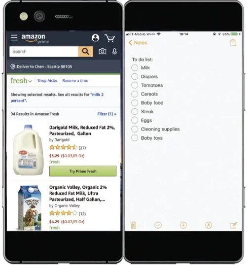
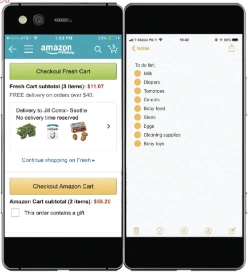
As a new mom, Mary wants to be more productive in less time, so that she can she can spend more time with her baby.
User Journey
Alison
User Story
As a student, Alison wants to use both dual screen and single screen to fulfill socializing, reading, and note-taking needs.
User Journey
UX & UI Patterns
UX & UI Patterns team created a library of UI patterns in the Figma for the app team to use.
Style Guide
Style guide team focus on aesthetic. They created a typography system and color palette.
Core Application: In 6 weeks, created 15 applications.
Over six weeks, our class was able to design a total of 15 applications for our Pear OS. In each of the two weeks, we were able to divide into five groups to work on a different application. In those two weeks, we were able to design high-fidelity screens for the application. At the end of the second week, we presented our application, and the next week we choose another application we wanted to work on and form a different team. We reiterated that design process for six weeks, and we were able to design a total of 15 applications for our Pear OS. At the end of the six weeks, we have an additional one week to fix our three designs before we submitted them. The professor would invite professional designers from the industry to grade our final design.
Core Application: Calendar
Here is the one of the core applications that I worked with the team. It is a calendar application for Pear OS.
The monthly view shows the monthly calendar with the agenda view at the bottom. Add event frame lets the users enter the event, times, and location with some additional reminder and repeat functions.
With Pear's ability to expand the phone into a tablet, our team designed a full-screen view for our calendar app. On the left side, it shows the monthly calendar with the agenda view at the bottom. On the right side, it shows the weekly time calendar; therefore, the users can know their free times.
Core Application: Music
Here is the another one of the core applications that I worked with the team. It is a music application for Pear OS.
Home: The homepage shows the new release albums and shortcuts for each category.
Search: The search has a search bar and also shows the users their top genres as well as other categories in the music player.
Library: The library shows the users' songs, artists, albums, and playlists. The users can also search specific items in their library.
Design Process: Preformed research → Created low-fidelity screens → Received feedbacks → Created high-fidelity screens
When designing the applications for Pear OS, we followed a similar design process. First, as a team, we began to research the existing apps. We draw inspirations from these apps and figured out what features we should implement into our application. After the research, we were able to break into small teams to work on the specific screens and create low-fidelity screens. We were able to receive feedback from our team, other students in this class, professor, and TA to make sure that our user flow was smooth and intuitive. After receiving the feedback, we were able to make changes to our screens and move onto the high-fidelity screens. We have to make sure that our design is pixel perfect and look professional.
My Responsibilities: In charge of design a specific screen, contribute from different perspective, collaborate with teams, make sure our screen is pixel perfect.
I was in charge of design for a specific screen. In the calendar app, I was in charge of the agenda view screen, and in the music app, I was in charge of the search screen. I contributed my personal experience with different applications to give our team inspiration on our design. I collaborated with my team and other teams to make sure that our design is following the Pear OS design system. Finally, I was very detail orientated and severed as another set of eyes to make sure that our screen is pixel perfect and make sure that all our screens followed the 8-points grid guideline.
Takeaways: Design applications for foldable device is a new experience, support applications with good user experience, communicate between teams, work in time constrains.
Design applications for a foldable device are new for everyone. It challenges me to design in an unfamiliar dimension and make sure everything is pixel perfect. Not only that, but I also learned how to follow the design system and make sure to support the visual aspects of the design system and the user experience guidelines. One of the most challenging problems was I need to have constant communication not just within my team but also in other teams as well. It challenged me to speak up and work together with others to make sure our design is consistent. Finally, I learned how to manage my time better to design high-fidelity screens that support the user experience within a two week constrains.

